
Tuesday, September 29, 2015
Tuesday, September 22, 2015
Queen Tea Logo
Queen Tea

As I was creating the Queen Tea logo, I had the idea of a simple, calming yet noticeable image for the company. This logo can be viewed clearly in almost any size; on a billboard, business cards, labels, etc. Thus, making this logo easy to manage for the company's products.
Every color has its purpose in the logo. The tea cup has a yellow, cream color. This color is calming, meaning purity. The idea of purity in the logo represents the purity of the tea; the consumers are having pure tea. Many tea lovers like the idea of pure and organic in their tea. The crown is black, so it has a strong contrast against the cream yellow cup. The color black means elegance. The company's products and image has an elegant approach. This isn't some ordinary tea shop, this is Queen Tea. The crown deserves an elegant yet simple color, like black. For the green tea leafs in the center, representing the "T" in Tea the other tea leaf in the bottom right corner, representing the "Q" in Queen with a deep, smooth green. This green tone represents nature, harmony and freshness. The consumers will perceive this tea as natural, good quality tea. This green also contrasts well against the black and yellow it has in its background.
The logo's shape is direct and simplistic. The tea cup is clearly shown, already having the tea leaf at the bottom right corner gives the consumers the message that it is a tea cup. The crown in the center shows dominance over the logo. Its black and bold elegance can be related to the Queen of England. Considering England is one the most well known tea consumers worldwide. In the center of the crown, the green, bold T made of tea leafs is part of what dominates the logo. It stands on the crown, like it showing power over tea. The tea leaf in the bottom right corner gives an organic shift to the tea cup and so the logo itself.
I find this logo to have a good representation of the company's concept. Elegant, calming and natural.
Monday, September 21, 2015

Monday, September 14, 2015
Queen Tea Logo Thumbnail Sketches
Here are a few thumbnail sketches for the Queen Tea concept.

This first sketch presents a Q, formed with a clean circle and a tea leaf to the bottom right. The Q is crowned by a tea crown, where two tea leafs are forming a T in the top center.

For this second sketch, a tea bag is used as a background. In the center of the tea bag, there is a crown drawn to resemble tea grains and on top of the crown there is a Q on top of a T, representing Queen Tea.

In this third sketch, there is a Q colored as if it were made out of tea grains in a tea bag. On top of the tea bag, there is a string attached to a small paper with the letter T on it, giving it an organic feel with the string. Next to the tea bag, the rest of the word "Queen".

The fourth sketch has a tea cup with a tea leaf on the bottom right corner, representing a Q. Inside the cop, there is a crown containing a large T in the center of the crown.

Finally for this fifth sketch, is a bird's eye view of a cup, with a tea leaf on the bottom right corner, also resembling a Q. Then in the center of the Q, a clear T is behind the tea leaf.
Analyzing Logos
One of the logos that have caught my attention because of its creative yet simple design is the Toyota logo.


If one looks closely, one can see all of Toyota's name letters incorporated in the logo. Ever since a friend showed this to me, I just loved it. I can also see headlights or wheels in the name's TOYOT. The logo has such simple, flowing lines that connect and form a well connected shape. A circle can resemble completion, connection, trust. The logo is easily recognizable from afar. The metallic effect gives it a modern, mechanic look and looks exactly the same when used on the automobile. The red name calls the attention and is clearly read from great distances. The font is clean and clear, Since the name is short and simple, thus memorable.
-
Another logo that caught my attention due to its smart design is Burger King's logo.
The logo makes me want to get a burger every time I see it. The logo has a pronounced burger shape, with bright red words and a happy toned yellow. It demonstrates how the burger shape is bigger than the buns, giving the illusion of a thick, juicy waiting to be eaten. The buns have a sort of shine, giving the logo depth and volume. The blue line surrounding the words can represent speed, continuity. Like Nike's logo, it can be viewed as a "swoosh!". This gives the impression of fast service. The font is clear and connected with the logo, it is an important part of it. The colors work well together, having effective negative space between each colorful element, making the words and art flow together. The yellow and red are also very well known for their food significance, giving the consumers an appetite. They also call the attention from afar, if the consumer is driving or walking, the Burger King logo can be seen clearly any time of the day.
-
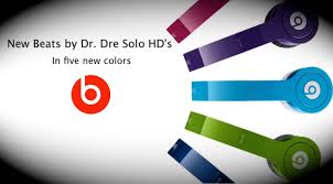
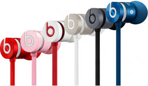
Beats by Dr. Dre logo has become a famous music icon within the last couple of years.
What makes this logo so useful is that its design is very flexible. The company keeps producing and creating newer headphones with different colors and themes. The logo fits great with any change they make to the headphones, it is an adaptable logo. In any color or theme, the logo is still clear and recognizable. The consumers can also edit the colors and design, without it harming or making the logo less visible. The logo itself has the same shape of the headphones. It can also be viewed as a musical note. The "b", standing for "beats" has always been recognizable and has a simplistic, modern design to the product.
-
The Crocs logo is another one that has always been recognizable, since it first started.
Crocs shoe brand target all audiences, but mainly children. Since the shoes are mostly made out of lasting plastic representing tough, crocodile skin, children would use it more for their young adventures. The logo has a smiling crocodile, with a young smirk and wide open eyes. The crocodile itself looks young but with rough skin, skin that can go through anything, which is the product's intention. The contrast the white crocodile gives the black, circular background makes it clear from far distances. As opposed to if the crocodile were black with a white, circular background. The name Crocs is playful and fun to say. Children and their parents can remember it easily. The font is a little similar to Crayola's logo font. Filling, circular, clear and has a young feel to it.
-
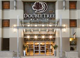
DoubleTree is a Hilton chain, spread all over the world and I have always appreciated its traditional and classy design.
DoubleTree has two beautifully designed trees incorporated into the D's vertical line. The tree trunks resemble a "II", referencing to the "Double". The logo contains two fonts. The word "DoubleTree" has its own, in a way separating it from "Hilton". Even though it is a Hilton branch, it has its own identity and brand. Fun fact: people remember it for the delicious complimentary cookies, having a DoubleTree special recipe. While Hilton keeps its own identity with its iconic font. The logo works together while also having different, separate elements. The art is what represents it, the name brands it, then Hilton claims it.
-
Friday, September 4, 2015
Ideas
1. Queen Tea
- Queen Tea would be a chain tea store. These Queen Tea stores lets you mix and make your own tea! In the shop, there are glass dispensers filled with all sorts of tea where the customers mix and choose their own tea. After the customers choose their tea, they hand it to one of the employees so they can brew the tea for them.
2. "Condy" Candy
- The name Condy comes from the combination of Connie (myself) and Candy, so Con-dy. Condy is a candy store that has its own recipe for any candy possible and is fairly priced. Condy is a place where families and friends can gather and enjoy delicious sweets together after a sour day.
3. Rent-A-Bra
- My friend Bri suggested that there should be a bra business that lets women of all cups have a quick, easy solution if any woman needed a bra. So we came up with Rent-A-Bra. Rent-A-Bra is a fine, clean bra supplier for women who do not like to make those long trips to the mall or are running short on laundry time. She can find the perfect bra in Rent-A-Bra's website or call to ask for bra options and have them delivered to her door! When she receives her bra, in the same bag, she can put in her used bras and send them to clean. After she is done with the rented bra, she can send it back and receive her clean bras! This means less laundry time, more clean bras!
4. FastFly
- FastFly is a company that owns a large series of helicopters that serve as sky taxis. It's faster, there's a FastFlyer (Fast Fly helicopter) with a FastFly pilot parked on roofs of buildings on each block. They are safer than getting in a cab with a stranger and cheaper since it travels faster. Also, the customer would look much cooler arriving at a party in a helicopter.
5. Rush Brush
- Rush Brush is a hair brushing robot that gently brushes a person's beautiful hair while he or she attends to other activities. Rush Brush brushes the person's hair while he or she brushes their teeth, complete writing an essay due that morning, prevent the person from having tired arms after brushing really long hair, or even while the person prepares dinner for visiting friends. Rush Brush helps get rid of the stress of having to spend time grooming hair and have time to make it look flawless!
Subscribe to:
Posts (Atom)